- HomeX Magazine
- Paint Colors
- How to use complementary colors in a room without clashing
How to use complementary colors in a room without clashing
Find out how complementary colors can brighten your room without clashing. Use the color wheel to balance shades and accent your space.
Words by Rosalind Tillery
- 7 minute read
Complementary colors sit opposite each other on the color wheel. Pairs like blue and orange or red and green create a striking contrast. Putting them together makes both colors look brighter and gives a room energy. You avoid clashing by letting one shade cover the walls while using the other only for small accents.
What complementary colors are on the color wheel
The color wheel organizes hues in a circle to show how they relate. Primary colors like red, blue and yellow space out evenly. Secondary colors like green, orange and purple sit between them. A complementary pair is simply any two shades that sit directly across from each other.
Red pairs with green, blue pairs with orange, and yellow pairs with purple. You can spin the wheel to find endless variations. A blue-green sits across from red-orange, while yellow-green sits opposite red-purple. These direct opposites represent the highest possible contrast in design.
Most complementary pairs also contain one warm color and one cool color. Red, orange and yellow warm a room up. Blue, green and purple cool it down. Mixing a warm hue with a cool hue creates a natural balance in the space.
Painters and designers have long used the color wheel to figure out which hues belong together. It is a simple tool that removes the guesswork from decorating. When you understand how colors sit on the wheel, you can mix them with confidence.
Why they make each other look brighter
Opposite colors push each other to the visual limit. The human eye perceives maximum contrast when these opposites meet. A pure blue wall looks deep and calm on its own. Put a bright orange chair against that wall, and the blue suddenly looks much richer.
The orange chair also looks brighter than it would against a gray wall. This optical illusion gives a room immediate energy. It pulls the eye right to the contrast point. Decorators use this effect to highlight architectural details or a beautiful piece of furniture.
You can use this trick to manipulate how a room feels. A dark corner wakes up completely when you introduce a contrasting pop of color. You just have to balance the visual weight so the room remains comfortable to sit in.
Let one color lead and the other accent
Equal amounts of two strong colors will fight for attention. A room divided evenly between blue and orange feels confusing and chaotic. The walls close in, and the space feels busy. You solve this by choosing a clear leader.
Give your main color most of the visual real estate. It should cover the walls, the large rug or the main sofa. Then use the opposite shade sparingly. Introduce it through throw pillows, a small side chair or lampshades.
The dominant color sets the mood of the room, and the accent color brings it to life. You might want to decorate a fireplace wall with your dominant shade. A rich blue fireplace draws the eye. A single copper pot on the mantel provides the orange accent.
You can also control the contrast through patterns. A solid blue wall feels heavy and dominant. A floral pillow that mixes small amounts of orange, white and gray feels light. The pattern dilutes the accent color so it does not overpower the room.
Neutrals and natural materials break up the tension
You do not have to rely only on paint and fabric to bring in complementary colors. Natural materials often do the job for you. Wood floors, exposed beams and leather furniture all carry strong orange and yellow undertones. A room painted in soft blue naturally contrasts with a warm oak floor.
Cherry wood and mahogany carry deep red tones. They stand out beautifully against soft green walls. Pale ash or pine leans yellow, making it a good partner for pale purple or lavender rooms. You get the benefit of complementary colors without buying more decor.
Houseplants provide a rich source of green. If you have a room with pale pink walls, a large fern or a leafy fig tree acts as the green accent. Blank spaces are just as necessary. White, cream, gray and beige give the eye a place to rest.
A room that is entirely blue and orange feels overwhelming. Painting the trim white and keeping the ceiling pale breaks up the intense colors. Neutrals act as a buffer between the contrasting shades.
Soften pairs with muted and deeper shades
Pure primary and secondary colors often look too harsh for a home interior. A bright red and pure green room looks like a holiday display. A pure purple and bright yellow room feels like a preschool classroom. You want the contrast, but you need softer versions.

Mute the colors by adding gray, brown or white. Darken them by adding black. Instead of bright orange, look at burnt orange, terracotta or rust. Instead of bright blue, consider navy, slate or a soft grayish blue.
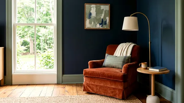
A navy wall behind a terracotta sofa looks sophisticated and rich. Pink is simply a lighter tint of red, and sage green is a muted version of green. Combining blush pink and earthy sage gives you a complementary pair that feels soothing.
As you choose interior paint, look closely at the darker and lighter ends of the paint strip. The most successful rooms usually rely on these modified shades.
Complementary pairs that work in real rooms
Certain opposite pairings translate beautifully to everyday living spaces. Blue and orange is a classic choice for living rooms and studies. A deep indigo rug anchors the space. A pair of worn leather armchairs provides the orange tone.
Green and red variations work well in kitchens and bedrooms. A kitchen with dark forest green cabinets looks moody and elegant. Adding a runner rug with deep burgundy and brick red patterns warms up the cold green. The kitchen feels balanced and inviting.
Yellow and purple can be the trickiest pair to get right. Keep the yellow soft, like a pale mustard or warm ochre. Pair it with a deep plum or eggplant. A bedroom with warm ochre bedding can look stunning with a small plum velvet pillow.
You get a touch of luxury without overwhelming the eyes. A subtle mustard stripe on a neutral curtain works beautifully with dark purple accents elsewhere. The room stays soft while still benefiting from the complementary energy.
Split complementary and analogous schemes for a calmer room
Direct opposites can sometimes feel too energetic. You can soften the impact by tweaking the color wheel rules. A split complementary scheme uses one base color and the two shades adjacent to its opposite. This creates a balanced look with less tension.
If you choose blue as your base, you skip the direct opposite orange. You use yellow-orange and red-orange instead. The room still benefits from warm and cool contrast. The visual jump is just slightly less jarring, making it feel more complex and layered.
An analogous color scheme abandons opposites entirely. It uses three colors that sit right next to each other on the wheel. Blue, blue-green and green create a very peaceful room. There is no sharp contrast at all.
The colors melt into each other. This approach works well for a quiet bedroom or a relaxing bathroom. Analogous colors usually agree, making them a safe choice for beginners.
Testing a scheme before painting
Lighting changes everything about a color scheme. A deep navy and rust combination might look brilliant in a bright paint store. The same pair could look muddy and dark in a north-facing hallway. You have to test both colors in the actual room.
Bring paint cards and fabric swatches home. Look at them together on a bright afternoon. Check them again under artificial light at night. Colors shift dramatically as the sun goes down.
A yellow accent might turn green under certain light bulbs. Do not paint small patches directly on the drywall. Paint a large piece of poster board instead. Move the board from wall to wall.
Lean your accent pillows or fabrics against it. Stand back and see how the two colors interact. A few days of testing will show you if the pair feels too loud or just right.
Flat paint absorbs light and softens a bold color, while high-gloss paint makes a bright shade look even louder. Test your paint in the finish you actually plan to buy. Matte walls with glossy trim in a complementary shade can add texture without requiring a third color.
If you decide to paint adjoining walls in contrasting colors, tape the corners carefully. Sharp lines matter when using strong hues. You want to paint an accent wall so the contrast looks intentional and neat. Wobbly lines ruin the effect.