- HomeX Magazine
- Paint Colors
- What color taupe really is and which paint colors go with it
What color taupe really is and which paint colors go with it
Taupe is a versatile blend of gray and brown that changes with the light. Discover exactly what color taupe is and which paints pair well with it.
Words by Rosalind Tillery
- 8 minute read
Taupe is a direct mix of gray and brown. This color sits right on the line between warm and cool. A true taupe brings the earthy depth of brown and the clean crispness of gray to your walls. Paint a room taupe, and the walls will shift color as the sun moves across the sky.
The balance between those two core neutrals makes it versatile. You get the welcoming comfort of a brown room without the heavy dated feel. You get the sleek finish of a gray room without the cold hospital chill.
Taupe is a gray brown and its undertones decide the mood
Brown and gray form the base of every taupe. The specific blend dictates how the paint feels in a room. Paint makers often tint the base with small amounts of red, green or purple to reach the final color. Those extra drops create the undertone.
Undertones stay hidden on a tiny paper swatch. They appear clearly once you roll the paint across a wide plaster wall.
Red and pink undertones pull the paint closer to a traditional tan. This makes a living room feel inviting and grounded. A warm, pinkish base softens the sharp corners of modern furniture.
Purple undertones push the color toward a muddy gray. A purple base adds a formal weight to a dining room. It creates a sophisticated backdrop for silver candlesticks and crystal glasses.
Green undertones act as a wild card. They neutralize the pinkness and make the taupe read as a stony, natural neutral. Green-based taupes mimic the color of river rocks. They work well in entryways that open onto a wooded yard.
Choosing the right base requires looking at your fixed elements. Stone fireplaces, hardwood floors and brick hearths already have their own undertones. The wall paint needs to acknowledge those existing colors.
A red brick fireplace will pull the pink tones out of a warm taupe. A slate floor will highlight the gray notes in a cool taupe. Match the undertone to the largest permanent surface in the room.
Tell a warm taupe from a cool one on the wall
Warm taupes lean heavy on the brown side of the scale. Cool taupes favor the gray. Telling them apart in a hardware store aisle can be hard. Fluorescent lights flatten out the subtle differences.
You have to compare them directly against a pure white background. Grab a piece of bright white printer paper. Hold your taupe swatches against that stark white sheet.
The pure white forces the hidden undertones to the surface. A warm taupe will suddenly look like a creamy mushroom. A cool taupe will look like a stormy concrete sky.
Place two different taupe swatches side by side. One will usually look slightly more yellow or red. The other will read as blue or purple by comparison. This visual trick helps you map out the color temperature.
Warm taupes wrap a bedroom in a heavy, comforting blanket. They make large, drafty rooms feel intimate. Cool taupes give a bathroom a clean, open feeling. They recede from the eye and make tight spaces feel slightly larger.
If you plan to add wall trim ideas that give a plain room some character, a cool taupe creates crisp shadow lines. The gray base makes architectural details stand out sharply against the drywall.
How light direction changes taupe through the day
Natural light controls how taupe appears on your walls. The sun strips away or highlights different undertones based on which way your windows face. A paint color that looks brown in the morning might turn completely gray by the afternoon.
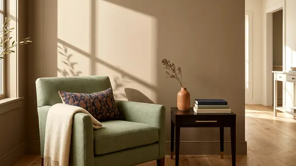
North-facing rooms receive cool, indirect sunlight. This bluish light enhances the gray tones in your paint. A balanced taupe will look much colder and flatter in a northern room.
You might want to pick a warmer taupe to combat that icy natural light. The extra brown base prevents the room from feeling like a cave.
South-facing rooms flood with bright, warm sunshine. Golden light amplifies the brown and red tones in the paint. A warm taupe can quickly turn into a heavy beige under a southern sun.
A cooler taupe handles south-facing rooms beautifully. The gray base absorbs the warmth without turning muddy. The walls will stay crisp even at high noon.
East and west rooms change dramatically as the clock ticks. Eastern rooms get bright morning light that washes out the brown.
Western rooms stay shadowy and cool all morning. Late afternoon light sets the walls glowing with deep brown warmth. You have to decide which time of day you use the room most. Pick a taupe that looks best during those specific hours.
Trim and ceiling colors that keep it crisp
Baseboards and door casings frame your taupe walls. The paint color you choose for your trim dictates how the taupe behaves. Pure white trim creates a harsh, clean boundary.
This stark contrast makes the taupe look darker and more defined. Crisp white trim works well with cool taupes in modern homes.
Soft white trim softens the transition between the wall and the woodwork. A white with creamy undertones bridges the gap nicely. It pulls out the brown base in the taupe. This combination feels traditional and rich.
Be careful with yellow-based whites, which can make taupe walls look dirty and aged.
Ceilings require careful thought. A standard flat white ceiling can sometimes feel too bright against dark taupe walls. The stark white lid draws the eye straight up.
You can paint the ceiling a lighter shade of the same taupe. This technique envelops the room and makes low ceilings feel higher. It erases the hard line at the top of the drywall.
If you prefer white ceilings, choose the exact same soft white you used on the trim. Use a flat finish for the ceiling and a satin finish for the baseboards. This keeps the room cohesive without feeling busy.
Colors that pair with taupe, soft white, sage, navy and black
Taupe plays well with other colors because of its split personality. You can match accent colors to either the brown or the gray base. The trick is to use complementary colors in a room without clashing.
Soft white remains the most reliable partner for taupe. White accents give the eye a place to rest. White linen curtains or a chunky knit blanket keep a taupe living room from feeling heavy. White ceramic lamps pop against a dark taupe accent wall.
Sage green connects the taupe to the outdoors. The muddy quality of sage matches the dusty finish of taupe. Paint a bathroom vanity sage green against taupe walls.
The two colors share a similar visual weight. They look intentional and calm together. Olive branches in a glass vase provide a cheap, fast way to bring green into a taupe dining room.
Navy blue provides the deep contrast taupe needs. Navy brings out the warm brown undertones by sitting opposite them on the color wheel. A navy velvet sofa anchors a pale taupe room.
Dark blue kitchen island cabinets look sharp against taupe perimeter walls. The combination feels nautical but grounded.
Black accents bring a sharp, modern edge. Matte black cabinet hardware or metal light fixtures pop against taupe walls. A black picture frame defines the art inside it.
Black stops the gray and brown blend from looking outdated. A few black throw pillows can sharpen a soft, warm taupe sofa.
Furniture and wood tones that look good beside it
Wood furniture introduces a third neutral to your room. The stain on your floors and tables must get along with your walls. White oak and light ash floors look beautiful with cool taupes.
The pale wood highlights the silvery gray notes. Bleached woods keep a taupe room feeling airy and light.
Walnut and dark mahogany furniture bring out the rich brown base. The dark wood grains pull the warmth out of a plain taupe wall. A heavy walnut dining table grounds a large, pale taupe room perfectly.
Cherry or red oak finishes can fight the subtle gray tones, so test them against the paint first.
Upholstery fabrics shift how taupe reads in a space. Natural linen sofas blend perfectly into warm taupe rooms. The woven fabric echoes the earthy tones.
Caramel leather chairs add a bright punch of warmth. The orange undertones in the leather wake up a sleepy gray room.
Cooler fabrics work just as well. Slate gray wool rugs ground a warm taupe wall. Blue patterned pillows draw attention to the crisp gray base.
Keep the fabric textures varied. Mix smooth leather with heavy knits to keep the room visually active. A taupe wall needs textured fabrics to keep the space from feeling flat.
Test it in two spots before you buy gallons
You cannot trust a tiny paper card. You need to see actual paint on your own walls. Buy sample pots of three different taupe paints. Get one warm, one cool and one right in the middle.
Once you choose interior paint and work out how much to buy, the testing phase begins. Paint a large square directly on the wall. Make the square wide enough to see from across the room.
Put the first square right next to the window casing. Put the second square in the darkest corner of the room. Paint all three sample colors side by side in both locations.
Paint a second coat to hide the old wall color completely. Leave the paint alone for a couple of days.
Check the squares when you drink your morning coffee. Look at them again at noon. Turn on your lamps at night and see how artificial light changes the undertones.
Cool white LED bulbs can mute warm browns, and warm yellow bulbs can turn a cool gray muddy.
Watch how the shadows stretch across the test patches. The right taupe will look good in full sun and in the dark corner.
The wrong taupe will turn purple at night or look like wet cement in the morning. Testing saves you from painting the entire room twice.