- HomeX Magazine
- Paint Colors
- How to build a color combination that flows through a house
How to build a color combination that flows through a house
Learn how to build whole house color combinations that flow from room to room using a simple strategy of neutral bases and repeated accent colors.
Words by Rosalind Tillery
- 8 minute read
Building a whole-house color scheme means picking a small set of colors and repeating them so rooms feel connected. You select one main neutral for hallways and open spaces, two supporting shades for individual rooms, and one dark accent for contrast. This approach creates a steady flow through the house without painting every wall the same color.
Build around the hard finishes
Look at the permanent fixtures before you look at paint chips. Wood floors, stone fireplaces, and tile counters set the underlying tone for the house. These fixed elements carry strong undertones. Those undertones dictate which new colors will look natural.
Warm oak floors fight against cool gray walls, and cherry wood cabinets severely limit your color choices. Take an inventory of the heavy furniture you plan to keep. A large navy sectional or a dark mahogany dining table commands attention. Paint must work with these anchor pieces.
Match your paint samples directly against the sofa fabric and place them against the floorboards. Doing this early rules out shades that clash with what you already own. Focus on the largest unbroken surfaces in each room, since the dominant wood tone provides a built-in color you must accommodate. Red brick throws off a lot of visual heat, while a slate floor introduces cool blues.
Identify whether your fixed elements run warm or cool. Warm elements lean toward yellow and red. Cool elements lean toward blue and green. Matching the temperature of your new paint to the temperature of your fixed finishes prevents jarring transitions.
Choose a main neutral for the open spaces
Hallways, entries, and open living areas need a single unifying color. This continuous shade carries the eye through the house and gives the layout a sense of structure. White, cream, beige, and soft gray perform best here. They reflect light well and provide a quiet backdrop for your belongings.
A solid neutral base prevents the house from feeling chopped into small boxes. Walk through the front door and look down the main hall. The color you see stretching ahead acts as the blank canvas for everything else. Test several neutral swatches against your trim and look at them next to your flooring.
Pick the one that looks clean and intentional in bright sunlight and flat shadow. The hardware store paint aisle offers a huge selection of whites and grays. Grab several chips and tape them to the drywall to narrow the choice down to three options.
Paint a large square of each option on the wall and watch how the colors behave from morning until night. Artificial lighting changes how a neutral looks, as warm light bulbs can turn crisp whites yellow and daylight bulbs can turn soft grays blue. Ensure your chosen neutral plays nicely with the lighting you already have installed. Choosing interior paint requires seeing how these subtle undertones shift throughout the day.
Choosing the right paint finish matters as much as the color itself. Hallways and open spaces see heavy foot traffic. Eggshell or satin finishes usually wipe clean more easily than flat paint without looking too shiny. Flat paint tends to hide drywall imperfections but can be harder to wipe clean.
Add two supporting colors and one dark accent
A house painted entirely in one neutral feels flat. Bring life into the scheme by selecting two supporting colors, like soft greens, muted blues, or warm earth tones. These mid-tone colors go into closed rooms like bedrooms and bathrooms. They give individual rooms personality without overwhelming the senses.
Select one dark accent color to ground the bright spaces. Charcoal, navy, forest green, or deep brown work well. Use this dark shade sparingly on interior doors, lower cabinets, or small furniture pieces. A dark accent gives the eye a place to rest and sharpens the lighter colors around it.
Four colors provide enough variety to give rooms individual character while keeping the whole house visually tied together. Restricting your palette forces you to make deliberate choices. Too many colors create a chaotic environment.
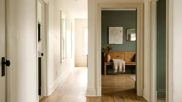
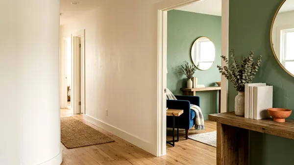
Stand in your hallway and look into the adjoining rooms. You should see a pleasing combination of your chosen colors. A soft green bedroom on the left looks deliberate next to a warm terracotta bathroom on the right. They balance each other across the hall.
Look to your wardrobe or your favorite artwork for inspiration, since people gravitate toward specific colors naturally. Pull a dominant color from a rug you love and use that as your first supporting color. Find a second color that looks good next to it. Make sure both supporting shades complement your main neutral.
Repeat every color in multiple rooms
A color looks out of place if it only appears once. Tie the floor plan together by repeating each chosen color in multiple spaces. A green used on the living room walls can appear again as a bathroom vanity color. It might show up in a guest bedroom down the hall.
The dark accent color should show up in small doses everywhere. Paint the interior of the front door dark navy, use that same navy for a lampshade in the bedroom, and throw a navy blanket on a chair in the den. This repetition builds a quiet rhythm. People walk from room to room and sense that the spaces belong together.
Apply the supporting colors in different proportions. One room might feature blue walls and green curtains. The next room might have green walls and a blue rug. The ingredients remain the same, but the recipe changes slightly from room to room.
Carry fabric swatches and paint chips with you when shopping for decor. Matching a new pillow to your established color scheme reinforces the visual connection between the rooms.
Change the depth of the color instead of the hue
You can alter the mood of a room without introducing a totally different color. Adjust the lightness or darkness of your chosen shades instead. Paint manufacturers print swatch cards with a gradient of one color family. Use this tool to your advantage.
Paint a bright bedroom in the lightest blue on the card. Paint a windowless bathroom in the darkest blue from the exact same strip. The hue remains identical, so the connection between the two rooms remains strong. Making a small powder room work often means leaning into deep shades for drama.
Rooms facing north often receive cooler light that can make colors look darker. Rooms facing south often get brighter, warmer light that can wash colors out. Adjust the depth of your chosen shade based on the window direction. Use a darker version of your color in a bright southern room, where the deeper shade holds its ground against the strong sun.
This method expands your palette safely and avoids breaking the underlying rules you established. A dark dining room feels formal and intimate. A pale version of that same color keeps the adjoining living room bright and airy.
Check the back of the paint chip. Manufacturers often suggest coordinating colors for each shade. Sticking to a single strip of colors removes the guesswork. The undertones usually match because the strip comes from one color family.
Pick one trim and ceiling color for the entire house
Trim, doors, and ceilings form the architectural skeleton of a home. Keep them uniform. Painting all baseboards and window casings the same white or cream acts as a visual boundary line. This crisp border separates the wall colors and frames the rooms consistently.
Ceilings usually take a flat version of the trim color. A pale shade of the wall color also works well. A single ceiling white used throughout the home simplifies the painting process. It stops the overhead plane from competing with your walls.
Interior doors usually match the trim color. Painting every bedroom and closet door a crisp white gives the hallway a uniform appearance. You can also paint interior doors in your dark accent color for contrast. A charcoal or navy door adds a strong detail to a plain hallway.
Consistency in the trim allows you freedom with wall colors. Adding touches like wall trim to a plain room looks best when the paint matches the home's woodwork. Do not switch trim colors between rooms. A sudden change from crisp white baseboards to cream baseboards looks like a mistake.
Choose a trim color that flatters your main neutral. Pure white provides a sharp contrast against dark walls, while a soft off-white blends better with warm beige or pale yellow. Test your trim choice against your kitchen cabinets if they are white. Clashing whites make one surface look dingy or yellowed.
Test the whole palette side by side
Colors behave differently depending on what sits next to them. Gather physical paint chips for your chosen neutral. Get samples of the two supporting colors and the dark accent. Lay them out together on a white table.
Look for any color that jumps out or looks muddy against the others. The transition from one color to the next should feel comfortable. Move the entire set of samples from room to room. Check them against the kitchen counters and lean them against the bathroom tiles.
Take pictures of your color samples with your phone. A photo can sometimes show clashing undertones that are easy to miss in person. Review the photos on your screen to double-check your choices. A green that looks muted on the table might look neon yellow on your screen.
Leave your samples out for a few days to see how they react to different lighting conditions. A cohesive scheme looks balanced as a group before a single drop of paint hits a wall. Paint large sample boards instead of painting directly on the drywall. You can move boards around the room to catch the light at different angles.
Hold your samples against the flooring in every room. A carpet in a bedroom might clash with a color that looked perfect on the hardwood in the hall. Finalize your choices only after seeing the colors together in the spaces where they will live. Good preparation can prevent repainting later.